Bright Concepts: Tremendous Texas
Election Day seems like an apropos time to share with you one of our favorite concepts ever. The idea never saw the light of day, but it was one of those that came together with a memorable brainstorm and just worked from the get go. We called it, “Tremendous Texas” and it was a concept to carry throughout a series of promotions for an event taking place in Austin in the fall of 2017.
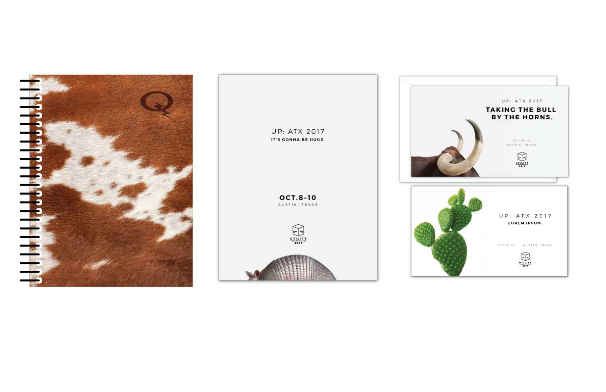
We drew inspiration from our great state, one of President Trumps favorite phrases, and the work of Austin-based, Photographer Randall Ford.
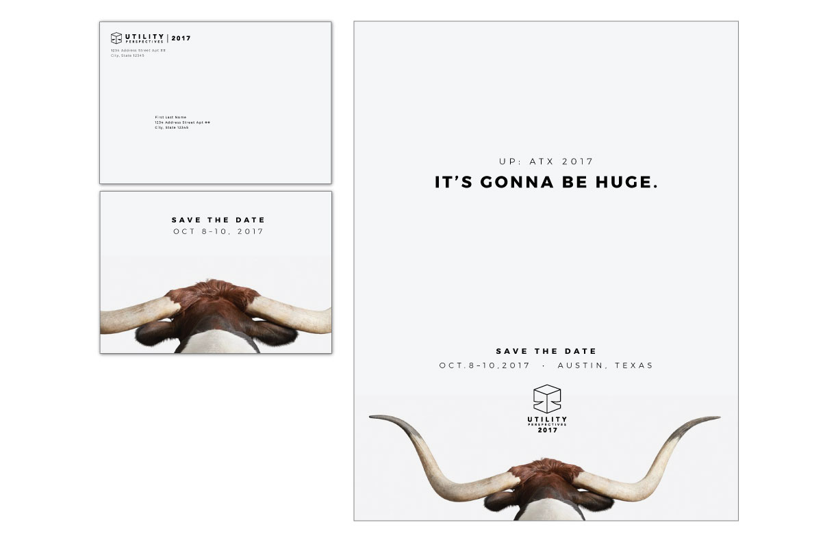
Quintessentially Texas animals on huge white backgrounds punctuated simple headlines to communicate the idea that “everything is bigger and better and Texas.” President Trump’s famous (infamous?) catch phrase, “it’s going to be huge,” served as the perfect headline and hook for the save the date event announcement. Body copy would go on to sell the concept of a bigger and better than ever event in honor of a milestone anniversary for the annual occasion. The balance of promotional materials also incorporated larger than life headlines to accompany photos of the same style featuring related, but different, images and punchy headlines.
Ultimately, the client loved the image of the longhorn featured in the save the date mailer concept, but chose to pair the image with the look and feel of another option presented. The finished piece communicated “Texas style” with western adornments and a more traditional design solution.
So it goes with the best client collaborations. “Our idea + your vision = the finished product.” The campaign that rolled out, though a departure from the concept we loved so much, is also among our list of finished favorites.
Take a look at some of the concept pieces below! And if you’re interested in seeing the actual campaign in our portfolio here.
Last but not least, if you haven’t already, get out there today and VOTE!
At this stage of the concepts we were presenting to the client, the content was still being fleshed out. So, where there was space where we knew we wanted text, we put greek so that they could still get the sense of what imagined for that piece.